Projects
About
Projects
About
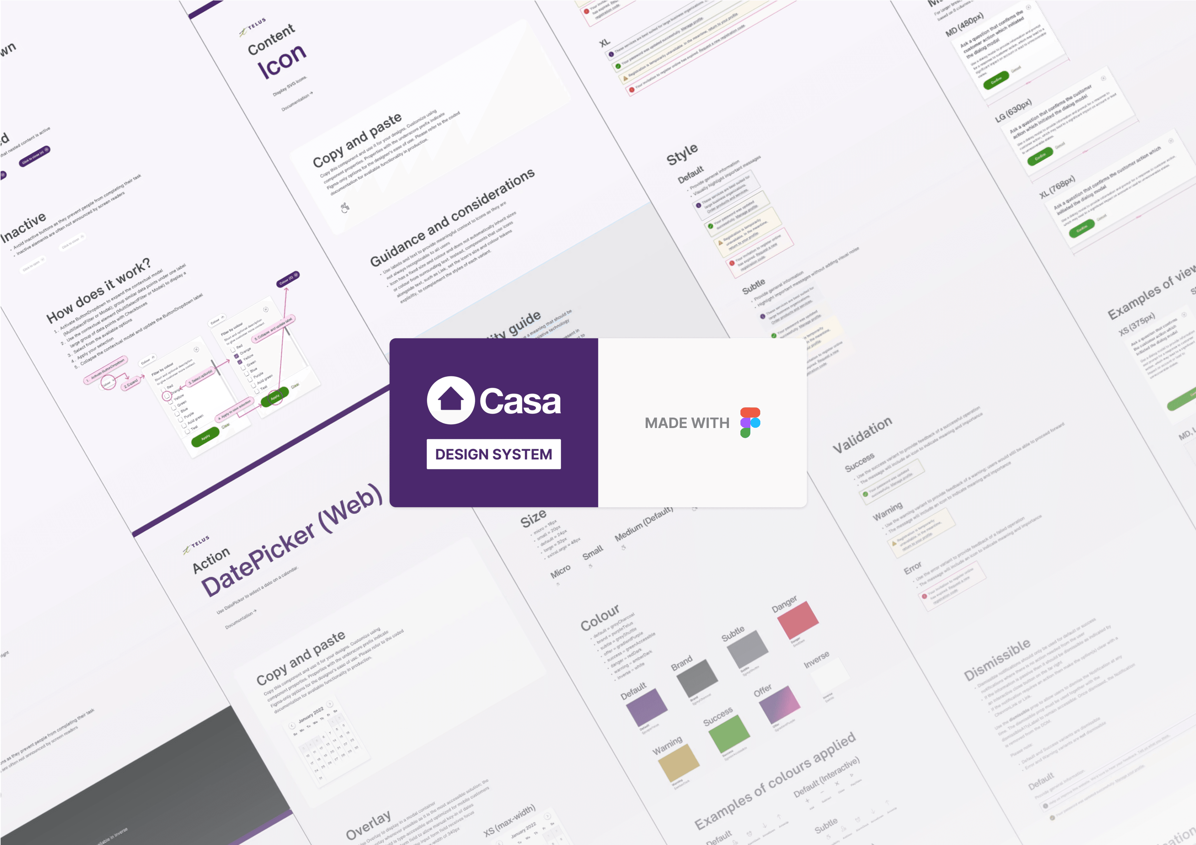
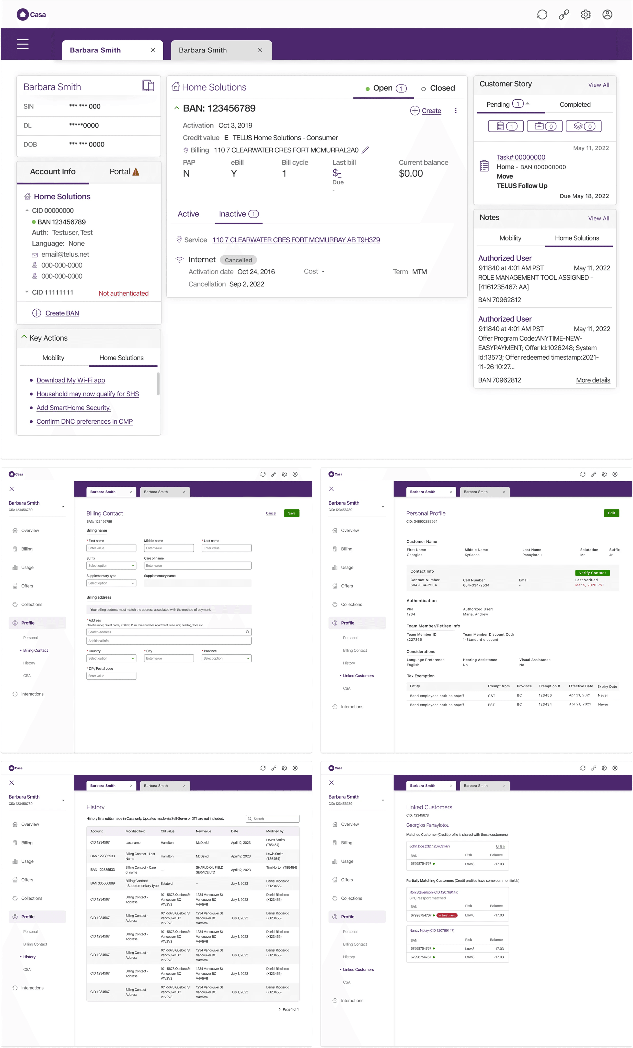
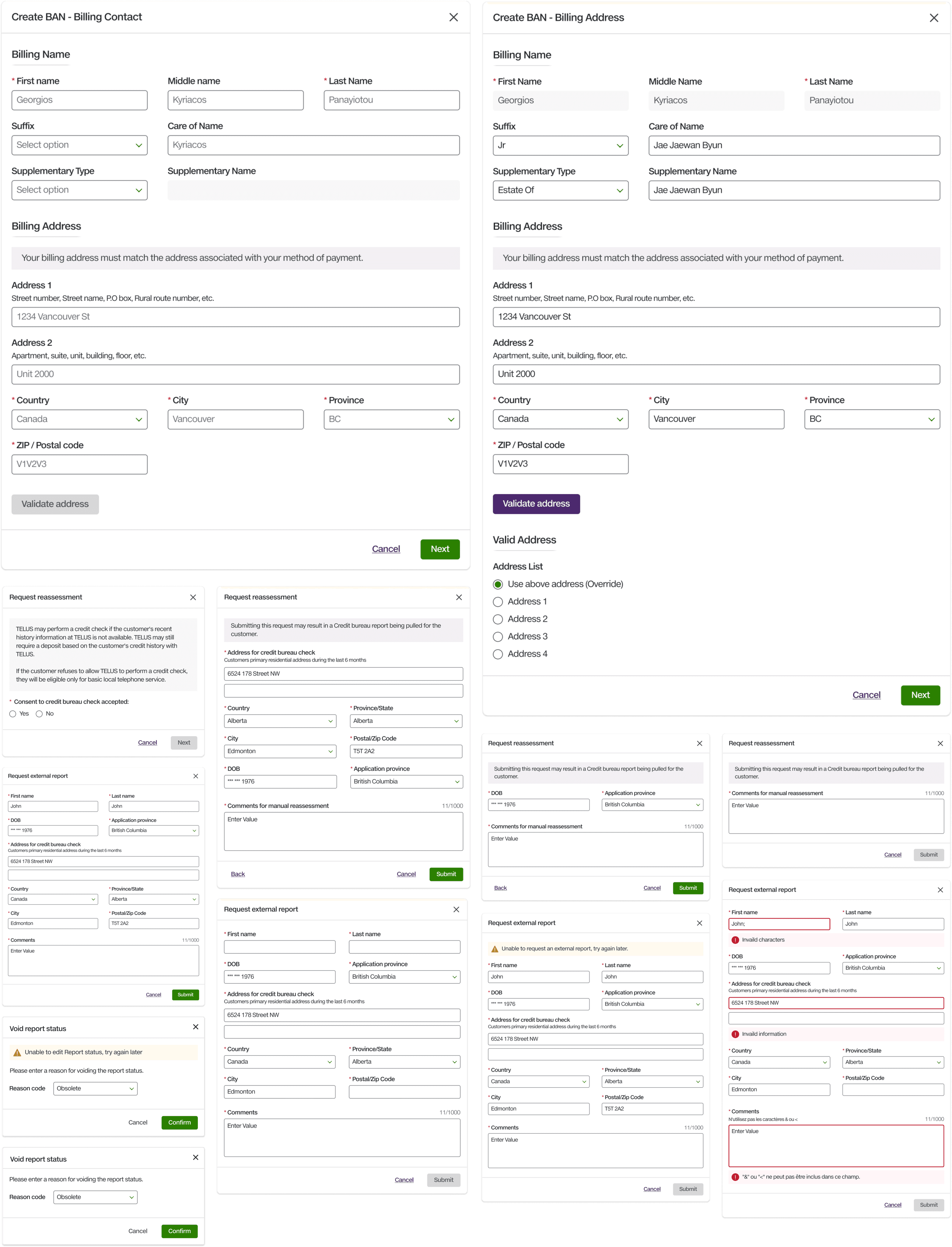
CASA