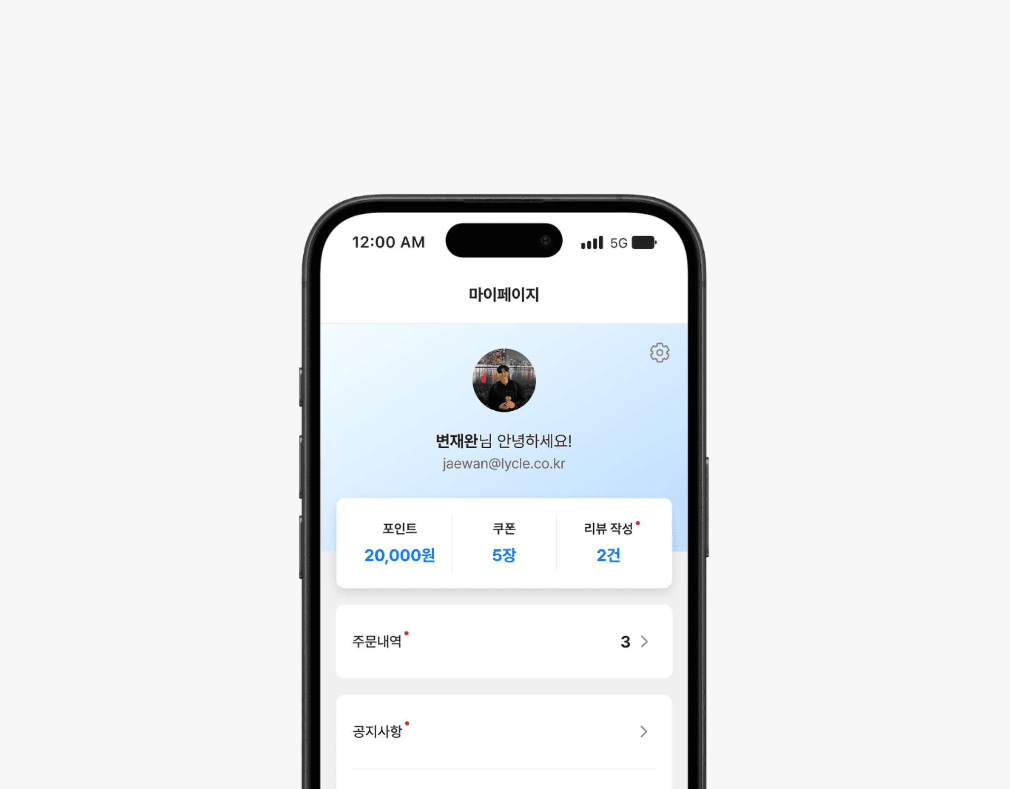
MY PAGE
‘마이페이지’ 개선 프로젝트는 기존 마이페이지의 정보 구조 및 사용 편의성 문제를 해결하고, 사용자들이 보유한 포인트와 쿠폰을 더욱 효과적으로 활용하도록 유도하기 위해 진행되었습니다. 개선 후, 포인트 사용량과 쿠폰 사용량 모두 두 자릿수 성장률을 기록했으며, 특히 객단가가 높은 자전거 구매 여정에서 할인 혜택 접근성이 개선된 덕분에 구매 전환율이 기존 대비 20% 이상 상승했습니다. 단순한 정보 열람 공간이었던 마이페이지를, 사용자에게 실질적 혜택을 체감시키는 구매 허브로 전환한 사례입니다.
The “My Page” improvement project tackled structural and usability issues in the existing My Page, guiding users to make fuller use of their points and coupons. As a result, both point usage and coupon redemption achieved double-digit growth, and in the high-average-order-value bicycle purchase flow, easier access to discounts drove a 20%+ uplift in conversion rate. This project transformed My Page from a static information list into a vibrant hub where anyone can quickly and easily engage with their benefits.
Year
2024
Company
Lycle
OS
APP, Web
Role
PM (20%), Product Design (100%)
Why?
마이페이지는 모든 사용자가 자연스럽게 방문하는 핵심 경로였지만, 기존에는 개인정보, 공지사항, 문의, 약관 등 필수 정보만 나열하는 데 그쳐, 포인트와 쿠폰 같은 혜택의 존재나 사용 가능성을 사용자에게 충분히 전달하지 못하고 있었습니다. 결과적으로 구매 직전 사용자의 전환 동기를 강화하거나 혜택을 체감시킬 수 있는 기회를 놓치고 있었으며, 쿠폰 및 포인트 사용 방법에 대한 문의가 고객센터로 유입되어 CS 리소스 소모도 발생하고 있었습니다. 마이페이지는 단순한 정보 열람 공간이 아니라, 사용자가 혜택을 체감하고 구매로 이어질 수 있는 전략적 경험 지점이어야 한다는 문제 인식에서 프로젝트를 시작했습니다.
Although My Page served as a natural entry point for all users, it mainly displayed static information such as personal details, notices, inquiries, and policies. It lacked clear visibility or actionable flows around benefits like points and coupons, missing critical chances to boost user motivation at the final purchase stage. This also caused repeated customer support issues related to unclear coupon and point usage. Recognizing that My Page needed to be more than a passive information portal, but instead a strategic touchpoint to activate user benefits and drive purchases, we initiated this redesign project.
Defined Problem 01
혜택 사용 경험을 강화하려는 목적에도 불구하고, 포인트와 쿠폰 활성화율은 기대에 크게 미치지 못했습니다. 3개월간 데이터 분석 결과, 전체 방문자의 48%가 탐색이나 혜택 확인 이전에 이탈했고, 회원가입을 완료한 26% 중에서도 12%는 구매로 이어지지 않았습니다. 행동 로그 분석에서도 마이페이지 내 쿠폰과 포인트 영역 진입 시도는 있었지만, 명확한 안내나 사용 흐름이 부재해 높은 이탈률을 기록했습니다. 이는 단순한 전환율 문제가 아니라, 혜택이 충분히 인지되고 체험될 수 없는 구조적 UX 문제였습니다.
Despite aiming to enhance the benefit usage experience, the activation rate of points and coupons remained low. A three-month analysis showed that 48% of visitors dropped off before exploring products or benefits, and only 12% of signed-up users completed a purchase. Behavioral logs were also showing attempts to access the coupon and point sections, however, poor guidance and missing usage flows caused high abandonment. This was not just a conversion issue but a structural UX flaw where users could not recognize or experience benefits early enough.
Defined Problem 02
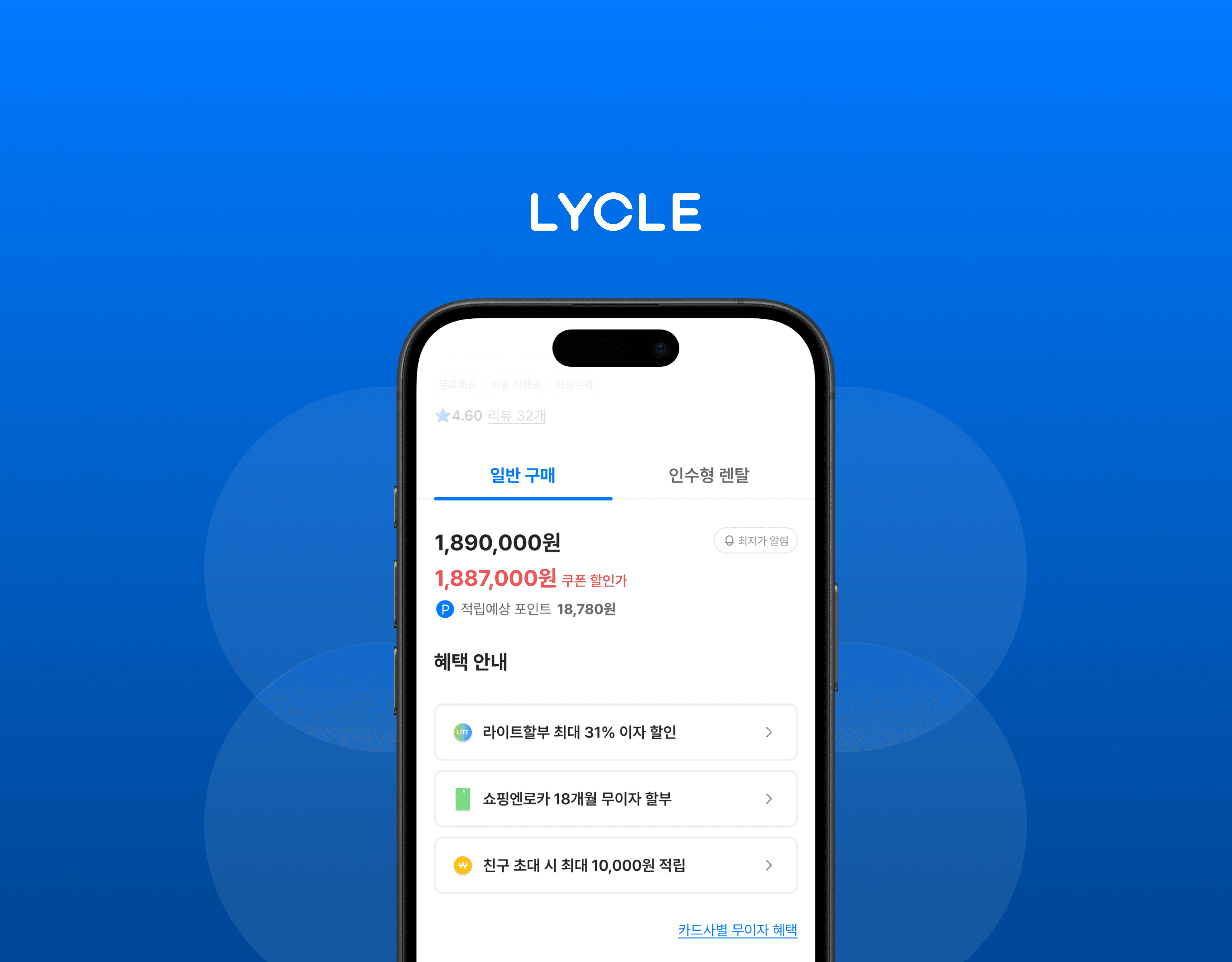
고관여 상품인 자전거의 구매 과정에서 사용자들은 할인 혜택을 활용하고자 하지만, 실제 데이터에서는 쿠폰 사용이 18.2%, 포인트 사용이 11.6%에 불과했고, 전체의 70.2%는 아무런 혜택 없이 구매를 완료하고 있었습니다. 마이페이지 내 쿠폰 및 포인트 영역 클릭 이후 이탈률이 61.5%에 달한 점에서 확인할 수 있었는데요, 언제, 어디서, 어떻게 적용되는지에 대한 정보 전달이 명확하지 않은 허들이 존재했습니다. 이로 인해 구매 전환이 저해되고, 관련 문의가 고객센터로 반복 유입되며 비즈니스 리소스까지 소요되었습니다.
Although users wanted to utilize discounts for high-consideration purchases like bicycles, only 18.2% used coupons and 11.6% used points while 70.2% completed purchases without any benefits. With a 61.5% drop-off rate after clicking the coupon or point sections on My Page, it was clear that unclear information on when and how to apply benefits created friction. This not only reduced conversion but also led to repeated CS inquiries and unnecessary operational costs.
솔루션 : 방향성
혜택은 사용자에게 구매를 유도하는 핵심 동기입니다. 그러나 기존 마이페이지는 로그인 여부에 따라 혜택의 존재와 활용 가능성을 충분히 전달하지 못했습니다. 이를 해결하기 위해, 로그인 전에는 회원가입 시 혜택을 적극적으로 안내하고, 로그인 후에는 보유 쿠폰·포인트를 최상위 정보로 노출하여 사용자가 즉시 혜택을 체감할 수 있도록 설계했습니다. 혜택 인지 → 가입 → 사용 → 구매로 이어지는 자연스러운 흐름을 만드는 것이 핵심 전략이었습니다.
Benefits are a key motivator for driving purchases. However, the existing My Page failed to effectively communicate the presence and usability of benefits depending on login status. To address this, we highlighted sign-up benefits on the pre-login view to encourage conversion, and surfaced available coupons and points at the highest visual hierarchy after login to ensure users could immediately recognize and use them. The core strategy was to create a seamless flow from benefit awareness → sign-up → usage → purchase.
솔루션 : 혜택 정보 시각화
전반적인 구매 과정에서 회원에게 제공되는 다양한 혜택 정보를 마이페이지의 로그인 전 화면에도 반영해, 사용자가 회원가입을 해야 하는 명확한 이유를 제시했습니다. 특히 ‘회원가입 시 쿠폰 지급’, ‘포인트 적립’, ‘추가 할인’ 등 구체적인 혜택 내용을 카드 형태의 시각 콘텐츠로 구성하여, 단순한 텍스트 안내를 넘어 직관적인 가입 유인을 제공했습니다. 또한, 향후 새로운 혜택이 추가되거나 내용이 변경될 경우를 대비해 이미지 기반 처리로 제작 리소스를 최소화했습니다.
Highlighted key membership benefits throughout the purchase journey by also exposing them on the 'My Page' for guest users, clearly communicating why signing up is valuable. Specific incentives such as “sign-up coupon,” “point accumulation,” and “additional discounts” were presented visually as card-style content, offering a more intuitive and engaging alternative to plain text. To minimize design overhead, these assets were image-based, allowing for flexible updates as new benefits are added in the future.
솔루션 : 혜택 체감 요소 추가
로그인한 회원의 경우, 사용 가능한 포인트와 보유 중인 쿠폰, 발급 가능한 쿠폰, 포인트 적립 가능 조건(예: 리뷰 작성 시) 등의 정보를 각 페이지에 맥락에 맞게 노출하여 사용자가 실제로 얻을 수 있는 혜택을 직관적으로 인지할 수 있도록 설계했습니다. 이를 통해 사용자가 자신의 혜택을 단순히 확인하는 수준을 넘어, 실제 구매 맥락에서 적극적으로 사용할 수 있도록 경험을 유도했습니다.
Exposed contextual benefit-related information across relevant pages such as available points, owned and claimable coupons, and point-earning conditions(e.g., writing reviews) so users could easily recognize the value they could receive. This allowed users not only to check their available rewards, but also to actively apply them in the purchase flow, enhancing perceived value and encouraging conversion.
결과
마이페이지 리디자인 후, 쿠폰·포인트 사용률은 기존 대비 각각 8.5%, 6.1%p 상승했으며, 마이페이지 진입 후 결제까지 이어진 구매 전환율도 4.2% 높아졌습니다. 이는 사용자가 혜택을 ‘어디서’, ‘어떻게’ 사용할 수 있는지를 명확히 이해할 수 있을 때, 실제 구매까지 이어지는 흐름이 유의미하게 강화될 수 있음을 보여줍니다.
특히 로그인 여부에 따라 혜택 정보의 구조를 차별화한 설계가 효과적으로 작동했으며, 회원가입 유도 콘텐츠 또한 클릭률이 기존 대비 2배 이상 증가했습니다. 이 결과는 혜택 인지 → 가입 → 사용 → 구매로 이어지는 흐름을 하나의 유기적 경험으로 설계하는 방식이 전환율 개선에 실질적인 영향을 미친다는 인사이트를 제공합니다.
After the My Page redesign, coupon and point usage rates increased by 8.5%p and 6.1%p respectively, and the conversion rate from My Page entry to purchase also improved by 4.2%. This indicates that when users clearly understand where and how to use their benefits, the overall purchase journey becomes significantly more effective.
In particular, differentiating the benefit information structure based on login status proved highly effective, and click-through rates on sign-up promotion content more than doubled. These results suggest that designing the flow from benefit awareness → sign-up → usage → purchase as one seamless and connected experience can meaningfully improve conversion outcomes.