


Purchase Experience
구매 경험 개선 프로젝트는 유입 경로에 대한 가설을 재검토하고, 구매 여정에서 정보 제공과 선택 흐름을 최적화한 프로젝트입니다. 전체 구매 사용자의 76% 가량이 외부 플랫폼에서 상세 페이지로 바로 유입되고 있었지만, 기존 플로우는 이를 효과적으로 수용하지 못해 상세 페이지에서 결제 시도로 이어지는 전환율이 0.7%에 머물러 있었습니다. 상품 정보 정형화, 옵션 선택 UX 개선, 혜택 및 리뷰 정보 고도화 등을 통해 상세 페이지를 구매 결정의 출발점으로 재설계한 결과, 전환율은 0.7%에서 0.95%로 개선되며 약 36% 향상되었습니다. 이후 사용자가 탐색부터 혜택 인지, 옵션 선택, 결제까지 빠르고 간결하게 진행할 수 있도록 했습니다.
Over 76% of users were landing directly on product detail pages from external channels, but the existing flow wasn’t optimized for this behavior, leading to a low 0.7% conversion rate to checkout. To solve this, I standardized product information, improved the option selection UX, and made benefits and reviews more visible to support better decision-making. As a result, I increased the conversion rate to 0.95% (a 36% improvement), helping users move smoothly from discovery to checkout process.
Year
2024
Company
Lycle
OS
APP, Web
Role
Product Design (100%)

Lycle’s purchase flow was originally designed to move users from Home to Model List, Product Detail, and then Checkout. However, data showed that over 90% of users were landing directly on product detail pages from external channels like search or partners, often after comparing products elsewhere. The detail page wasn’t built for this behavior. Key information was missing, and the lack of guidance resulted in low conversions. Identifying this gap became the starting point for the project.

문제 발견
구매자의 76%가 상세페이지에서 시작해요
팀은 공헌이익 확보를 위한 구매 전환율 개선을 KPI로 얼라인했지만, 기존 데이터만으로는 이탈 지점과 전환 저해 요인을 명확히 식별하기 어려웠습니다. 이에 온보딩부터 구매까지의 실제 사용자 여정을 8개월간의 행동 데이터로 정밀 분석한 결과, 전체 구매 사용자의 76.3% 이상이 네이버 스마트스토어를 통해 상세페이지로 바로 유입되고 있었으며, 상품 검색부터 가격 비교, 구매까지 모든 과정을 라이클 내에서 완결할 것이라는 기존 가설과 실제 사용자 흐름이 크게 불일치하고 있음을 깨달았습니다.
Team aligned on improving purchase conversion as a core KPI, but existing data didn’t clearly reveal where users were dropping off or why. To close this gap, we analyzed 8 months of behavioral data across the full journey from onboarding to purchase. What we found challenged team's assumptions. Over 76.3% of users were landing directly on product detail pages via Naver Smart Store, bypassing the intended flow within Lycle from search to purchase. This revealed a critical misalignment between user behavior and our original journey design.

문제정의
상세 페이지가 구매 결정을 이끌기에 정보와 동기가 충분하지 않았어요
데이터 분석 결과, 대부분의 사용자가 외부 플랫폼을 통해 상세 페이지로 직접 유입되는 것으로 나타났습니다. 그러나 현재의 상세 페이지는 사용자가 구매를 결정하기 위한 충분한 정보와 명확한 선택 흐름을 제공하지 못하고 있었습니다. 실제 유입 데이터를 살펴본 결과, 외부 플랫폼을 통해 라이클 상세 페이지로 진입한 사용자의 결제 페이지 전환율은 10% 미만이었습니다. 이는 상세 페이지에서 결제로의 자연스러운 흐름이 부족하여 사용자의 결제 시도를 어렵게 만들고 전환율을 크게 낮추는 원인으로 분석되었습니다.
Analysis showed that most users were landing directly on product detail pages from external platforms. However, overloaded visuals and unclear hierarchy made it difficult for users to notice key benefits at a glance. As a result, they struggled to move forward, and conversion remained low.

문제 해결
상세 페이지 중심으로 전환 구조를 다시 설계하다
상세 페이지를 구매 여정의 시작점으로 재정의하고, 사용자가 결제 시도까지 자연스럽게 이어질 수 있도록 구매 결정 과정의 장벽을 해소하는 것이 목표였습니다. 이를 위해 세 가지 핵심 영역을 설정했습니다.
1. 구매 방식 UI 구조화
사용자가 상품을 구매할 때 가장 먼저 맞닥뜨리는 옵션 선택 과정에서 혼란을 줄이고자 했습니다.
2.혜택 정보 재구성을 통한 인지 향상
혜택 정보가 복잡한 구조를 패턴화 하여 직관적으로 제공해, 사용자가 정보를 빠르게 인지할 수 있도록 했습니다.
3. 리뷰를 통한 신뢰 확보와 구매 동기 강화
가격과 스펙 정보를 이미 알고 있는 사용자에게는 타인의 리뷰를 통해 실제 사용 경험과 만족도를 전달하도록 했습니다.
To help users move smoothly from product discovery to purchase, I simplified option selection into clear step-by-step flows to reduce confusion, reorganized benefit information to improve visibility and highlight value, and surfaced reviews to build trust and support confident purchase decisions.


솔루션 01: 구매 방식 UI 구조화
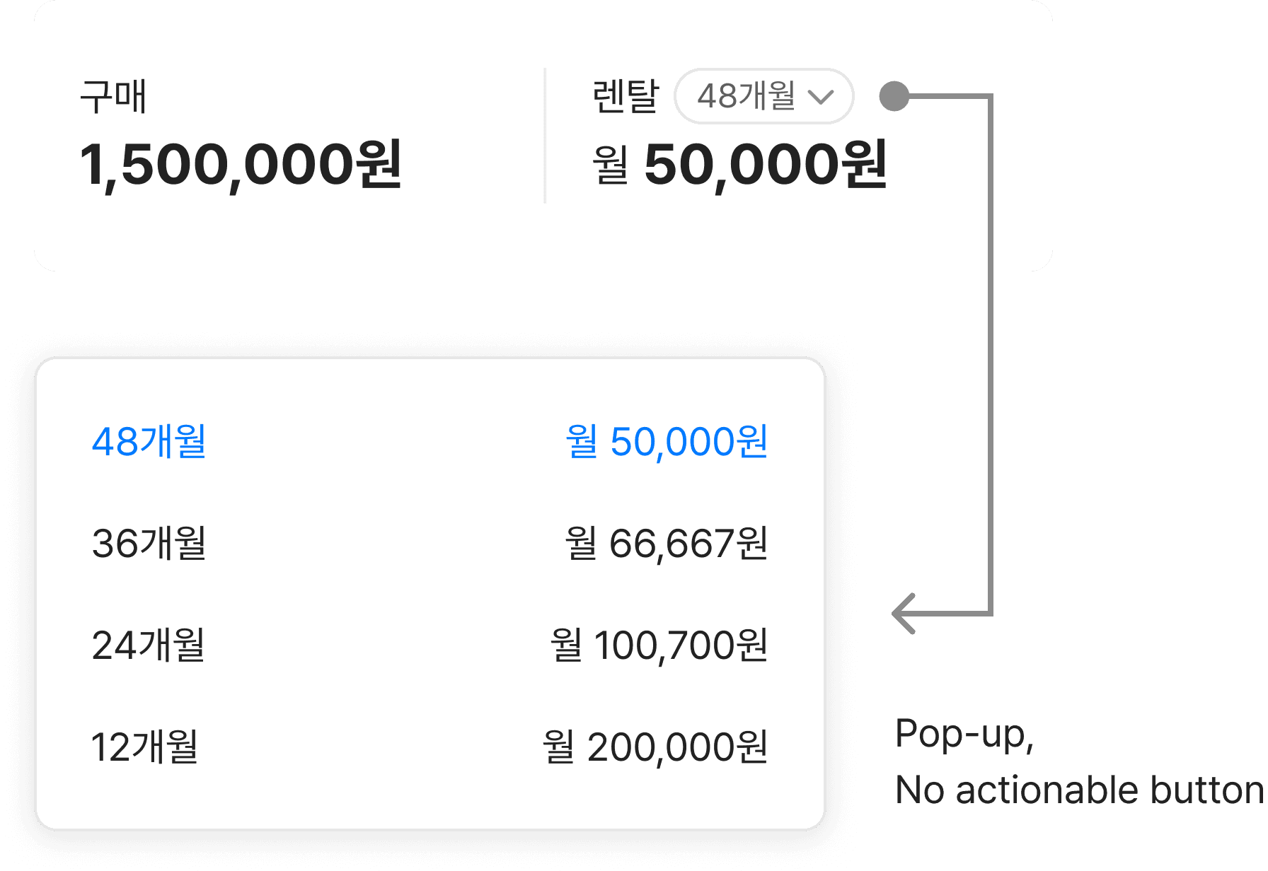
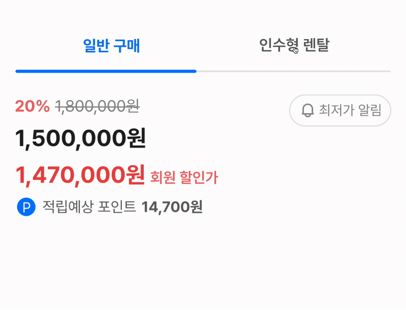
기존 UI는 일반 구매와 인수형 렌탈 옵션을 동일한 영역에 노출하며, 제한된 공간과 복잡한 정보 구조로 혜택과 조건을 명확히 전달하지 못했습니다. 특히 구매 옵션 관련 문의가 전체 CS 문의의 30%를 차지할 정도로 사용자 혼란이 컸고, 이는 정보 설계 측면에서 개선이 필요함을 보여주는 지표였습니다. 두 옵션을 한 화면에 모두 표시하는 방식이 오히려 이해를 방해한다고 판단하고, 탭 컴포넌트를 통해 완전히 분리된 구조로 재설계했습니다. 선택한 옵션에 따라 관련 정보만 노출하도록 구성한 결과, 옵션별 차별성이 명확해졌고 공간 활용과 가독성 또한 크게 향상되었습니다.
The previous UI displayed both standard purchase and buyout rental options in a single space, creating a dense and confusing structure that failed to clearly communicate their differences. This led to user confusion, with related inquiries accounting for 30% of all customer support tickets, a clear sign that the information architecture needed improvement. I redesigned the flow by separating the two options into distinct tabs, ensuring only relevant details appeared based on user selection. This approach clarified the differences, reduced cognitive load, and significantly improved readability and overall decision-making.

솔루션 02: 혜택 정보 재구성을 통한 인지 향상
혜택 정보가 여러 영역에 분산되고 표현도 일관되지 않아, 사용자가 가치를 빠르게 인지하기 어려웠습니다. 특히 결제 직전에 혜택을 확인하지 못해 이탈하는 경우가 많았습니다. 이를 해결하기 위해 모든 혜택 정보를 하나의 영역에 통합하고, 유형별로 일관되게 구성해 한눈에 파악할 수 있도록 재정비했습니다. 가장 중요한 정보만 우선 노출하고, 상세 내용은 별도 페이지에서 확인할 수 있도록 엔트리 구조로 설계했습니다.
Benefit information was visually scattered and inconsistent, making it difficult for users to understand the value. Qualitative research showed that many users dropped off due to a lack of clear guidance on available discounts. To solve this, I centralized all benefit content into a single section with a consistent structure highlighting key points and linking out to detailed information.

솔루션 03: 리뷰를 통한 신뢰 확보
가격과 스펙 정보를 이미 알고 있는 사용자에게 판매처 선택의 핵심은 신뢰였습니다. 자전거 시장은 제조사 가격 통제로 정가 판매가 일반적이었고, 판매처 간 차별화는 자체 할인이나 서비스 품질로 이루어지고 있었습니다. 사용자들은 이러한 구조 속에서 더 나은 서비스를 제공하는 판매처를 선호했습니다. 이런 구매 패턴에 맞춰 리뷰를 신뢰 요소로 활용하고 상단에 배치했으며, 긍정적인 경험과 혜택 사례를 강조해 사용자가 확신을 갖고 최종 결정을 내릴 수 있도록 설계했습니다.
For users already familiar with the product’s price and specs, trust in the seller was the key factor in their final decision. In the bicycle market, where manufacturer price controls limited discounts, sellers competed through service quality and added benefits. As a result, users preferred sellers offering better service under similar conditions. To address this, I elevated reviews as a trust signal placing them at the top and highlighting positive experiences and benefits to help users feel confident and complete their purchase.


결과
구매 경험 개선 프로젝트를 통해 외부 플랫폼에서 상세페이지로 유입되는 사용자의 흐름에 맞춰 상품 정보 구조, 옵션 선택 UX, 혜택 노출 방식을 재설계한 결과, 상세페이지에서 결제까지 이어지는 구매 전환율이 0.7%에서 0.95%로 약 36% 향상되었습니다.
개선 전·후 2주간의 유입-결제 전환 데이터를 비교 분석하여 도출했으며, 동일한 외부 유입 채널 기준으로 필터링해 상세페이지 구조 변화의 영향을 정량적으로 측정했습니다.
이는 사용자의 행동 패턴을 인위적으로 바꾸기보다는 기존 유입 흐름을 고려해 맞춤형으로 개선하고, 탐색 → 혜택 인지 → 옵션 선택 → 결제까지의 여정을 하나의 연결된 경험으로 설계했기 때문에 가능한 성과였습니다.
As part of a purchase experience optimization project, I led the redesign of the product detail page to better align with actual user entry points—specifically users landing directly from external platforms. By restructuring product information, streamlining the option selection flow, and elevating benefit visibility, I improved the conversion rate from product page view to purchase from 0.7% to 0.95%, a 36% uplift.
To validate the impact, I conducted a comparative analysis using Growthbook, measuring two weeks of behavioral data before and after the redesign. I filtered for external traffic only, ensuring that the performance lift was directly attributable to the structural changes on the detail page.
Instead of trying to shift user behavior, I optimized around existing patterns—designing a seamless journey from landing → benefit awareness → selection → checkout. This user-first approach not only improved clarity but also significantly reduced friction, directly contributing to higher conversion outcomes.

