

Do startups really need
a design system?
Building design system from scratch
why this problem mattered.
As Lycle scaled, every designer worked by their own standards. Buttons, spacing, and components were inconsistent across every screen. Feedback loops grew longer, engineering handoffs became draining, and users experienced a different product on every page. Without a shared system, every new feature meant rebuilding from scratch.
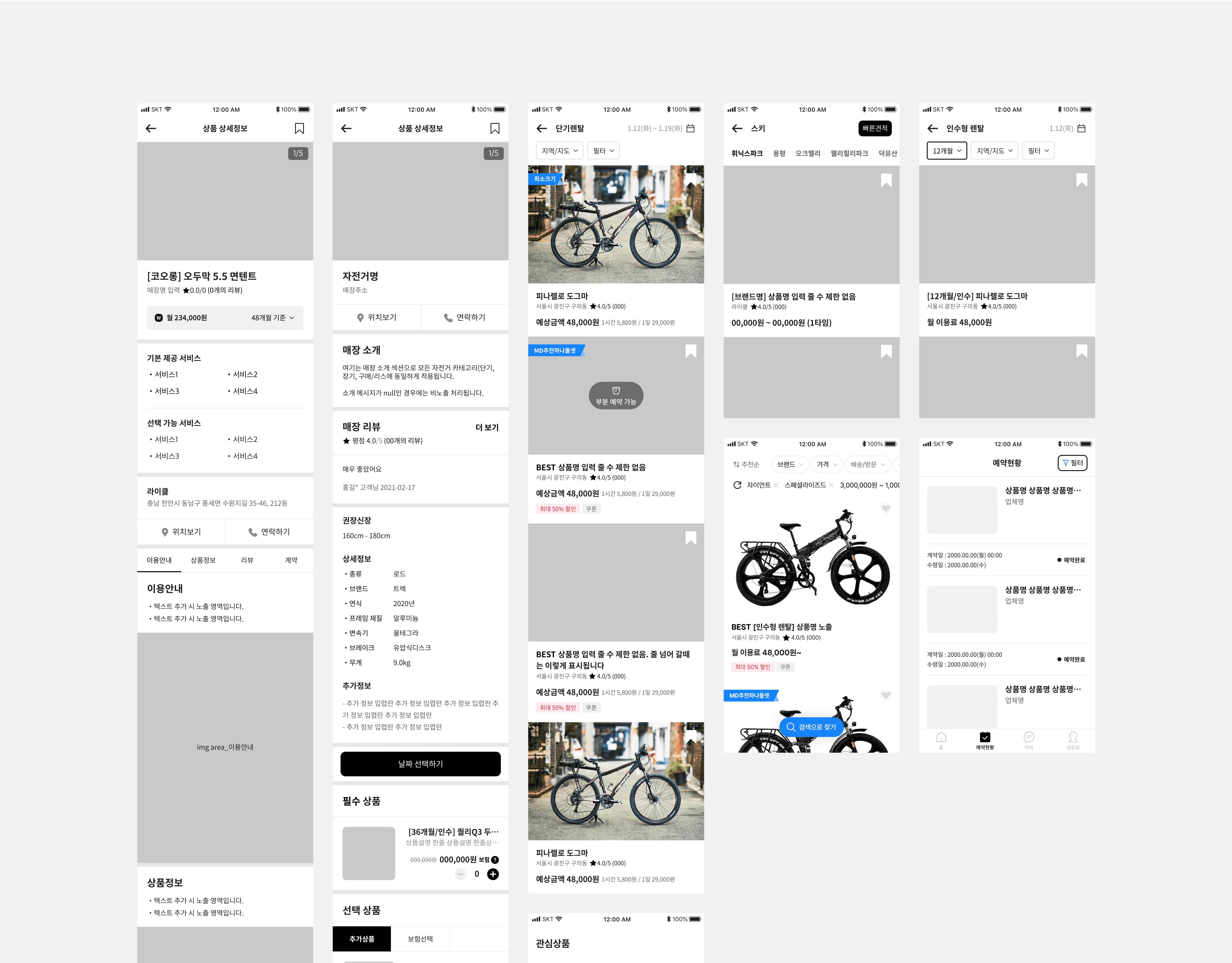
UI fragmentation examples
how I defined the real problem.
The surface problem was messy UI. The real problem was no shared language to work from. Over 40 unique button variations, 3 different type scales, and no single source of truth between design and engineering.

Experience gaps workflow
what I believed was causing it
Two categories of root causes. Internally: no onboarding standard, and Figma files full of one-off UI with no master/instance relationships. Externally: no design tokens, making consistency dependent on individual attention rather than system structure.

Internal & External causes
what I used to prove it.
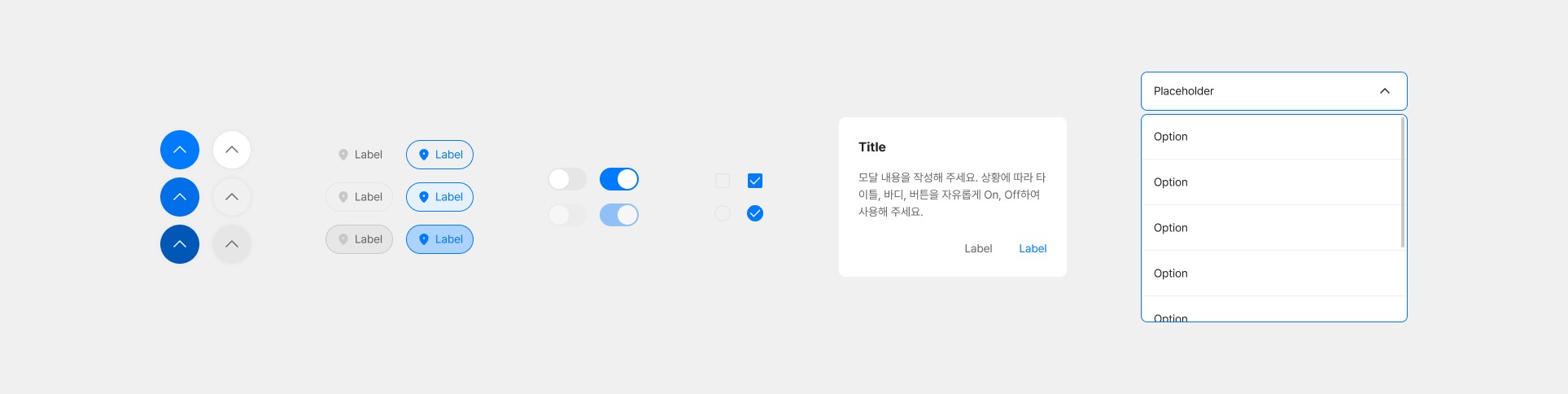
I ran a full UI audit, cataloguing every component and style in use. Usage frequency analysis pointed to buttons, input fields, and modals as the first build targets. Before touching components, I defined three shared design principles as a decision-making framework, not just a style guide.

Design Principles
From there I built the foundation: a 5-step icon scale with stroke and shape standards, a full typography scale from Display to body, and a primitive color token table mapping every value to named tokens. This became the single source of truth everything else was built on top of.

Foundation 4-panel — Icon, Typography, Primitive color tokens
what choices I made.
I prioritized components by usage frequency, expanding across Input, Display, Feedback, and Navigation. The rule was predictability over completeness; every component had to behave consistently across all states before moving on.
Organizing components
Defined LYTEM’s foundational styles
how I validated it.
The hardest call wasn't craft; it was deciding what not to build yet. Keeping scope tight was what made adoption happen. Engineers trusted the library. Designers stopped rebuilding foundations.
Component review and quality check
LYTEM V1.0.0 shipped as a shared Figma library with a Notion doc covering usage guidelines, specs, and decision rationale. Any designer or engineer could onboard without asking anyone.
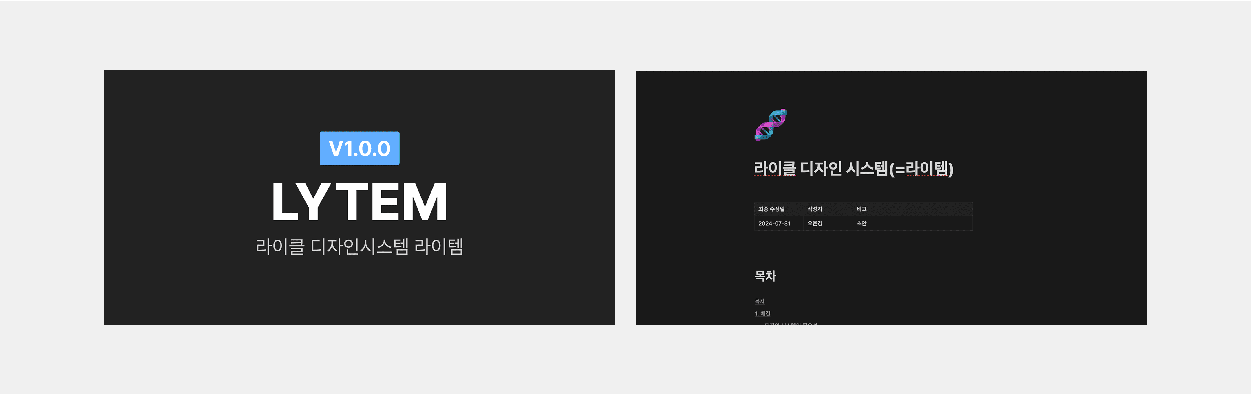
Documentation in Figma and Notion — LYTEM V1.0.0
LYTEM: Lycle’s Design System


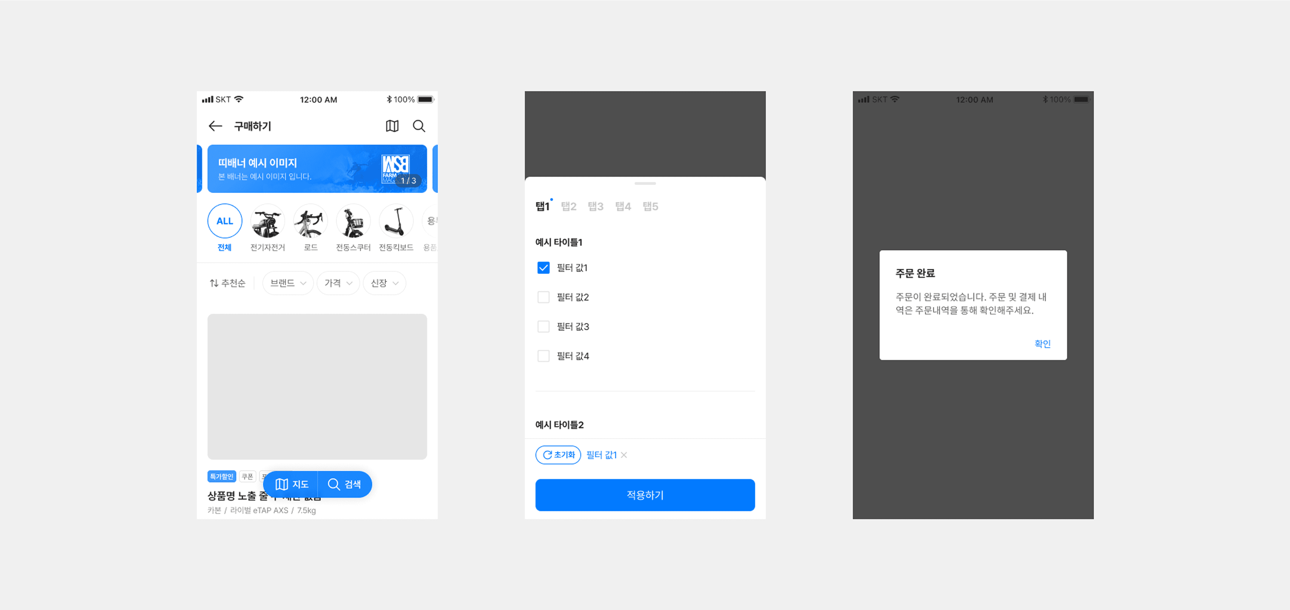
Input components
Display components

Feedback components
Navigation components
results & learning.
Results: 30% improvement in cross-team delivery speed, faster design-to-engineering handoffs, measurable reduction in revision cycles, and noticeably more consistent brand experience across the product. New designers were able to onboard into the system and contribute production-ready work within their first sprint.
Learning: The hardest design system decision isn't what to build; it's what to defer. Shipping a smaller, trusted system faster creates more momentum than waiting for completeness. Its value isn't tidiness; it's giving everyone the same basis for making decisions.
what's next.
Evolving components from real usage data, integrating tokens into the engineering pipeline via Storybook, and maturing LYTEM into an experimentation infrastructure that directly supports A/B testing and rapid prototyping.
Enter Password
Hint: Please contact me for more detail